DATA STORYTELLING / ART DIRECTION

Setting the style on a carbon emissions report for Visual Capitalist

Freelance work for data journalism publisher Visual Capitalist, defining the art direction for a client report on carbon emissions from North American utility companies.

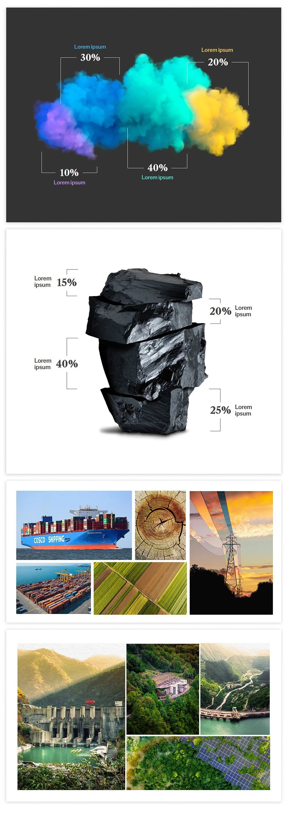
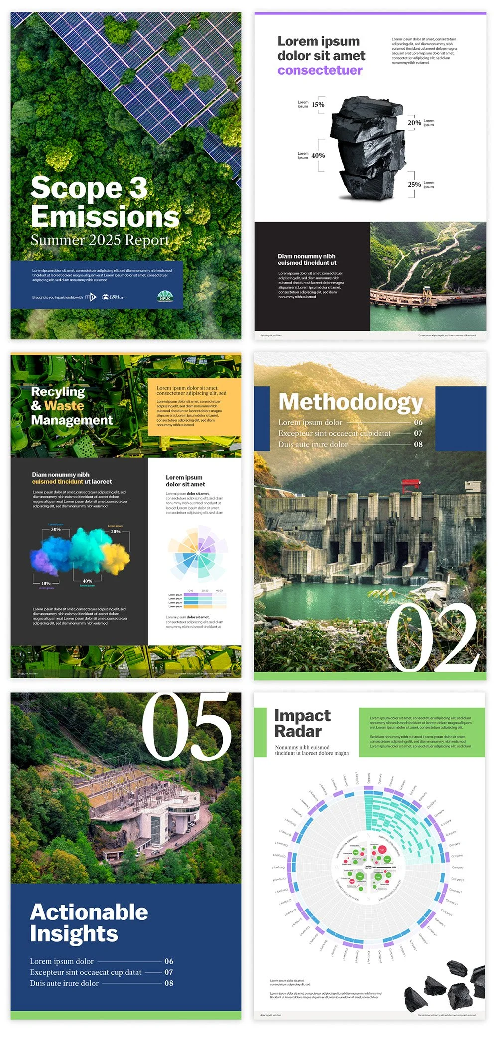
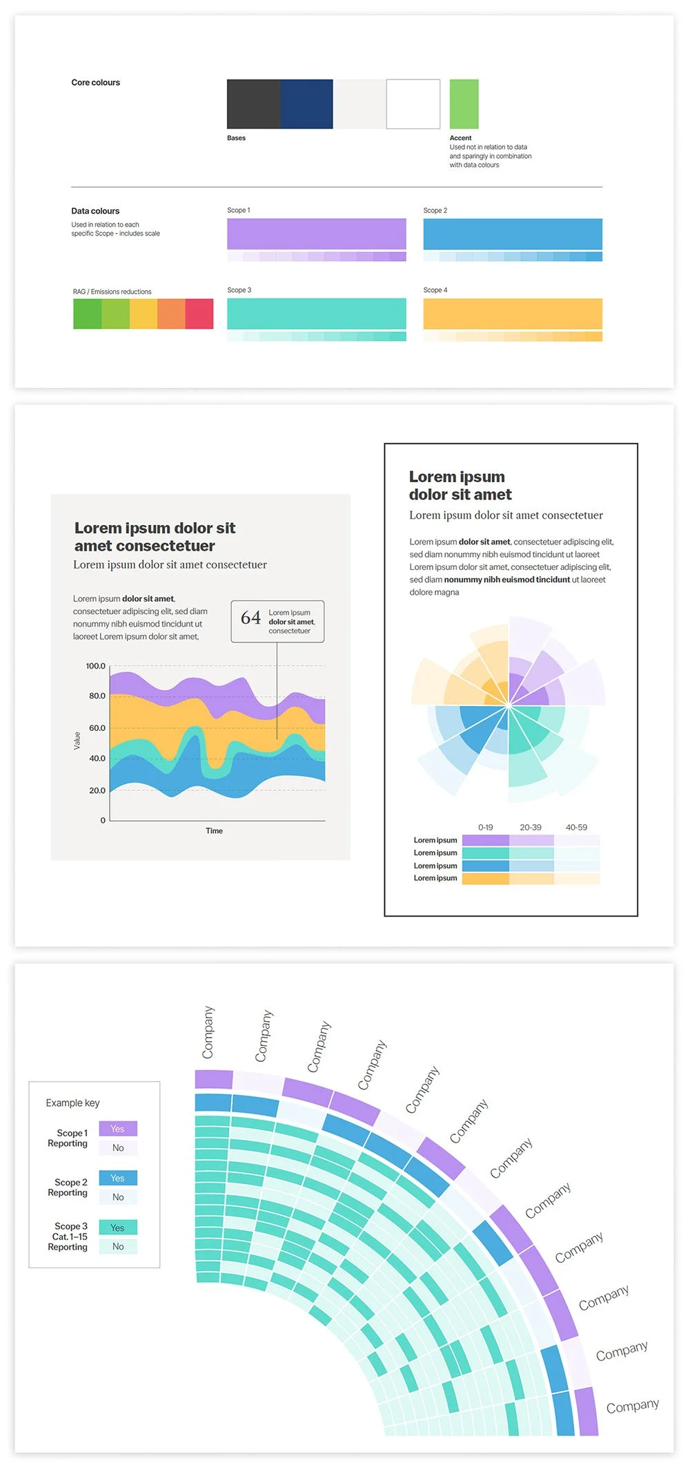
The report was designed as an engaging, 10-page, magazine-style publication. The art direction covered typography, colour palette, data treatment (including a radial heat map), chart styling, photography-based visualisations, and imagery direction and treatment, all culminating in a set of sample page layouts.
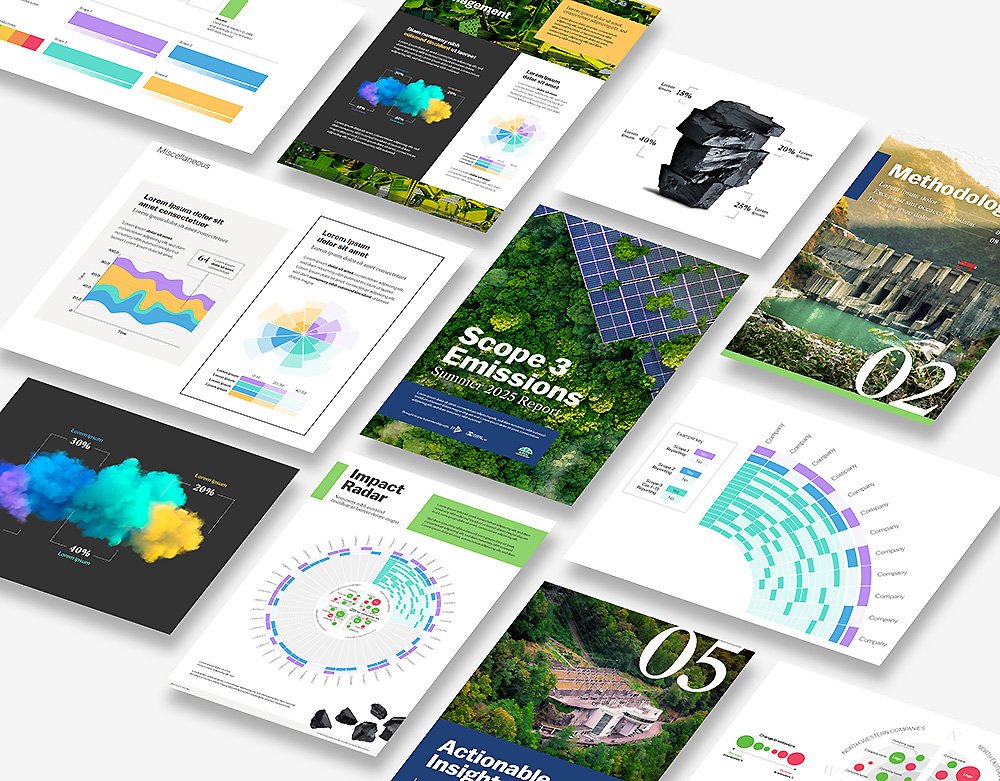
Collection of colorful business and environmental report pages featuring charts, graphs, and images related to sustainability, technology, and impact analysis.
Collection of infographics including color palettes, data visualizations like stacked area charts, circular charts, and a heat map, with placeholder text and labels for data analysis.
A collage of four images: The top image shows colorful cloud bursts with percentage labels; the second image shows a stack of black coal pieces with percentage labels; the third image features various modes of transportation, such as a cargo ship, an airplane, and a cargo terminal, along with images of wood, power lines, and a sunset; the bottom image displays multiple scenic views of hydroelectric dams, forests, and solar panels.
A collection of six pages from a report or presentation about environmental topics. The pages include images of solar panels on a forest, a graph with black rocks, a dam with water, a scenic road, a modern house in the woods, and a circular chart with data. Text includes headings like 'Scope 3 Emissions,' 'Recycling & Waste Management,' 'Methodology,' 'Impact Radar,' and 'Actionable Insights'.